
- Community
- News & Updates
- Buying & Selling
- Product Categories
- eBay Groups
- eBay Categories
- Antiques
- Art
- Automotive (eBay Motors)
- Books
- Business & Industrial
- Cameras & Photo
- Clothing, Shoes & Accessories
- Coins & Paper Money
- Collectibles
- Computers, Tablets & Networking
- Consumer Electronics
- Crafts
- Dolls & Bears
- Entertainment Memorabilla
- Gift Cards & Coupons
- Health & Beauty
- Home & Garden
- Jewelry
- Music
- Pottery & Glass
- Specialty Services
- Sports Mem, Cards & Fan Shop
- Stamps
- Toys & Hobbies
- Travel
- Business Insights
- Regional Groups
- Special Interest Groups
- Developer Forums
- Traditional APIs: Orders, resolutions and feedback
- Traditional APIs: Search
- Traditional APIs: Selling
- eBay APIs: Talk to your fellow developers
- eBay APIs: SDKs
- Token, Messaging, Sandbox related issues
- APIs Feedback, Comments and Suggestions
- RESTful Sell APIs: Account, Inventory, Catalog and Compliance
- RESTful Sell APIs: Fulfillment
- RESTful Sell APIs: Marketing, Analytics, Metadata
- Post Order APIs - Cancellation
- Post Order APIs - Inquiry, Case Management
- Post Order APIs - Return
- RESTful Buy APIs: Browse
- RESTful Buy APIs: Order, Offer
- Promoted Listings Advanced
- Seller Meeting Leaders
- 30th Anniversary Celebration
- eBay Live
- eBay Categories
- Community Info
- Events
Turn on suggestions
Auto-suggest helps you quickly narrow down your search results by suggesting possible matches as you type.
- eBay Community
- eBay Groups
- Special Interest Groups
- Art & Artists
- ATC & ACEO Enthusiasts
- Forum
- Need scanning advice....
Options
- Subscribe to RSS Feed
- Mark Topic as New
- Mark Topic as Read
- Float this Topic for Current User
- Bookmark
- Subscribe
- Mute
- Printer Friendly Page
Need scanning advice....
Options
- Mark as New
- Bookmark
- Subscribe
- Mute
- Subscribe to RSS Feed
- Permalink
- Report Inappropriate Content
04-04-2006 05:26 PM
Hi everyone...I'm looking for advice on settings for scanning art. I don't have a snazzy scanner (it's an Epson 1000ICS)...I'm wondering if I adjust the exposure, gamma, highlights, etc. if it will make a difference in the scans. I've played around with it some, but I'm never really satisfied as the scans just don't show the depth in the real piece. Is it just my scanner or do any of you have any suggestions?
Thanks, Cyndi
Message 1 of 17
16 REPLIES 16
Need scanning advice....
Options
- Mark as New
- Bookmark
- Subscribe
- Mute
- Subscribe to RSS Feed
- Permalink
- Report Inappropriate Content
04-04-2006 05:48 PM
I'm no technical expert, but I've found that playing around with brightness and contrast adjustments in Photoshop does wonders. Most of the time, no amount of adjustments does the piece justice, especially once it's at 72 dpi on a computer screen. Also, each scanner seems to have quirks, like mine intensifies yellows and makes bright green look way too yellowish.
Are you scanning colour or graphite pieces?
Message 2 of 17
Need scanning advice....
Options
- Mark as New
- Bookmark
- Subscribe
- Mute
- Subscribe to RSS Feed
- Permalink
- Report Inappropriate Content
04-04-2006 06:27 PM
I use paint shop pro as my program to adjust scans.
I've only just now started scanning at lower dpi than 300 and I'm much more pleased.
Reds and oranges are near on impossible to get accurate.
But then, I'm having problems with photos, too. 😞
~Jillian
artist, Jillian Crider
... google me!
artist, Jillian Crider
... google me!
Message 3 of 17
Need scanning advice....
Options
- Mark as New
- Bookmark
- Subscribe
- Mute
- Subscribe to RSS Feed
- Permalink
- Report Inappropriate Content
04-04-2006 07:28 PM
I use an Epson scanner as well. I adjust the brightness/contrast in photoshop (sometimes saturation too) to make my scan look more accurate. But no matter what you do, it will never look as good as it does in person.:(
I have problems with reds & oranges too Jillian, not sure how to fix that.
Message 4 of 17
Need scanning advice....
Options
- Mark as New
- Bookmark
- Subscribe
- Mute
- Subscribe to RSS Feed
- Permalink
- Report Inappropriate Content
04-04-2006 07:32 PM
I've never tried making adjustments in another program after I've scanned a piece...I've just been trying to adjust the settings for the scan itself. I will try your suggestions. Jillian...I thought the higher dpi, the better the scan...I've been scanning between 400 and 800. I guess I should try lowering the dpi...
Karen, I've been scanning all of my work, both color and graphite. I've got a digital camera, but I am not pleased at all with the results of the pictures. I've tried every type of light I could, but cannot get true colors at all, especially on smaller pieces like ACEO's.
I'll try playing around with adjusting them after the scan and see what I can come up with. Thanks for your help!
Message 5 of 17
Need scanning advice....
Options
- Mark as New
- Bookmark
- Subscribe
- Mute
- Subscribe to RSS Feed
- Permalink
- Report Inappropriate Content
04-04-2006 07:56 PM
If I used the images straight off my scanner I'd never get any images in my listings!
Paint Shop Pro is also great for adjusting photos, too.
Definitely lower dpi for a start, though.
~Jillian
~Jillian
artist, Jillian Crider
... google me!
artist, Jillian Crider
... google me!
Message 6 of 17
Need scanning advice....
Options
- Mark as New
- Bookmark
- Subscribe
- Mute
- Subscribe to RSS Feed
- Permalink
- Report Inappropriate Content
04-04-2006 08:07 PM
We had to get a new scanner around Christmas because the other one kicked the bucket. The new one can scan really high, which would be good for reproduction some day. The new one can scan at 2400 dpi although it has higher settings too, but I've never tried them. When I list, I use the "save for web" setting that lowers it to 72 dpi to speed uploading.
Message 7 of 17
Need scanning advice....
Options
- Mark as New
- Bookmark
- Subscribe
- Mute
- Subscribe to RSS Feed
- Permalink
- Report Inappropriate Content
04-04-2006 08:27 PM
Thanks again for all the helpful advice...now to see if I'm smart enough to figure out saturation and tone and grayscale, etc. :)
Cyndi
Message 8 of 17
Need scanning advice....
Options
- Mark as New
- Bookmark
- Subscribe
- Mute
- Subscribe to RSS Feed
- Permalink
- Report Inappropriate Content
04-04-2006 08:37 PM
Nothing like practice practice practice!
Scan something in that is very colorful, and just play with it. Don't pressure yourself to make it look good for a listing you are getting ready to go.
Most of us own computer and electronic equipment where we don't know 1/10th of its functionality. At least, I know its true for me!
Chel
Message 9 of 17
Need scanning advice....
Options
- Mark as New
- Bookmark
- Subscribe
- Mute
- Subscribe to RSS Feed
- Permalink
- Report Inappropriate Content
04-04-2006 09:18 PM
For me, too, chel! I just try to think of it all as OJT (on the job training)...even if it is blind me leading blind me! Sometimes that's the best way to figure it all out:)
Message 10 of 17
Need scanning advice....
Options
- Mark as New
- Bookmark
- Subscribe
- Mute
- Subscribe to RSS Feed
- Permalink
- Report Inappropriate Content
12-20-2007 02:33 PM
Hello everyone! I'm new to this forum and I realize this is kind of an old post but I do believe I can offer something very helpful.
For all the tech stuff there is a great website called lynda.com. You can pay 25 dollars for one month and look for the photoshop training for color correction. There are loads and loads of other training for different software but that is the one I recommend for any kind of image correction.
Hope that helps,
Laila
Message 11 of 17
Need scanning advice....
Options
- Mark as New
- Bookmark
- Subscribe
- Mute
- Subscribe to RSS Feed
- Permalink
- Report Inappropriate Content
12-20-2007 05:04 PM
a couple of tips (at least these work for me and my particular combination of scanner and software - ScanMaker X6EL and PhotoShop or Corel PhotoPaint)
If you have a lot of white/light areas in the art, set your brightness a couple notches lower on the scanner software. Otherwise, any detail you might have in that light area gets completely lost. You can always lighten up where needed with your photo editing software.
Play with the contrast settings in your photo editor. I find that most everything loses some contrast in scanning. The darkest darks and lightest lights get lost. Your contrast settings should show a histogram (graph) of some sort, tweak the outermost sections - this'll bring back your darks and lights and won't affect the mid-tones too much.
For graphite drawings, scan as color and then convert the image mode to duotone (a combination of 2 colors), using the darkest black in your palette (I use Black 6 CVC 2X from the Pantone palette) and a yellow (I use Process Yellow CVC) to give it a warmer tone. I always have to adjust the color curve afterward to tone back the yellow quite a bit. Then you'll have to convert the duotone back to color to save as a JPG.
I scan at 500 dpi 'cause I often make cards/prints of my ACEOS. After I color correct, then I resample to 72 dpi and save that as a new file. If you scan at low res, you won't have the option to do much else with the image except post it on the web.
And if you have a little extra money to spend, get a "Huey" monitor color calibrator. They're made by Pantone, easy to use and they do a good job of matching your monitor to reality. They're under $100 and available on-line - just google "Huey".
--
-Ann
"Anyone who considers protocol unimportant has never dealt with a cat." -- Robert A. Heinlein
-Ann
"I have got pepperoni. Wherever it lands, that's where the miracle will happen." ~ Gary Busey
"I have got pepperoni. Wherever it lands, that's where the miracle will happen." ~ Gary Busey
Message 12 of 17
Need scanning advice....
Options
- Mark as New
- Bookmark
- Subscribe
- Mute
- Subscribe to RSS Feed
- Permalink
- Report Inappropriate Content
12-20-2007 05:11 PM
Here are an uncorrected and corrected pencil ACEO:
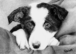 as scanned - greys are very "cool"
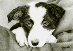 after converting to duotone and then back to color - greys are "warm"
--
-Ann
"Anyone who considers protocol unimportant has never dealt with a cat." -- Robert A. Heinlein
after converting to duotone and then back to color - greys are "warm"
--
-Ann
"Anyone who considers protocol unimportant has never dealt with a cat." -- Robert A. Heinlein
-Ann
"I have got pepperoni. Wherever it lands, that's where the miracle will happen." ~ Gary Busey
"I have got pepperoni. Wherever it lands, that's where the miracle will happen." ~ Gary Busey
Message 13 of 17
Need scanning advice....
Options
- Mark as New
- Bookmark
- Subscribe
- Mute
- Subscribe to RSS Feed
- Permalink
- Report Inappropriate Content
12-20-2007 10:22 PM
I don't have Photoshop but I do have Gimp. Any Gimp users who know how to get those effects with the freeware? Supposedly it can do everything Photoshop can, but figuring out how to do it is pretty tough.
I've noticed that different scanners drop different hues. Mine does great for reds and oranges but drops bright yellows sometimes or yellow-greens -- and they can appear the same to my eye, but different mediums or even brands will appear or not. I try to keep track of which brands of yellow colored pencils show up on scans or not to get better reproduction for prints. My latest ACEO will get no prints because I could not find a way to put in yellow that had dropped out, short of turning it into a digital artwork by painting it in.
--
robertsloan2art -- original ACEO, OSWOA and larger artwork. A big part of life is recognizing that creativity is human. It's not limited to a special Talented few gifted and cursed by the gods to become high-paid superstars
Message 14 of 17
Need scanning advice....
Options
- Mark as New
- Bookmark
- Subscribe
- Mute
- Subscribe to RSS Feed
- Permalink
- Report Inappropriate Content
12-20-2007 11:16 PM
I suggest scanning as .bmp or .tif if you plan on adjusting your scan with a painting program. If you adjust a .jpg, you can lose data/image quality when you resave.
I scan at 300ppi for a good picture quality. You can always lower the resolution to 72ppi for the web as a final step if you want to.
Something to remember is whether you might ever want to do prints of your work. 300ppi is probably the minimum for that purpose and if you scan at higher ppi, you can make prints larger than aceo size also.
Sandra
Sandra
Message 15 of 17
Featured Posts


