- Community
- News & Updates
- Buying & Selling
- Product Categories
- eBay Groups
- eBay Categories
- Antiques
- Art
- Automotive (eBay Motors)
- Books
- Business & Industrial
- Cameras & Photo
- Clothing, Shoes & Accessories
- Coins & Paper Money
- Collectibles
- Computers, Tablets & Networking
- Consumer Electronics
- Crafts
- Dolls & Bears
- Entertainment Memorabilla
- Gift Cards & Coupons
- Health & Beauty
- Home & Garden
- Jewelry
- Music
- Pottery & Glass
- Specialty Services
- Sports Mem, Cards & Fan Shop
- Stamps
- Toys & Hobbies
- Travel
- Business Insights
- Regional Groups
- Special Interest Groups
- Developer Forums
- Traditional APIs: Orders, resolutions and feedback
- Traditional APIs: Search
- Traditional APIs: Selling
- eBay APIs: Talk to your fellow developers
- eBay APIs: SDKs
- Token, Messaging, Sandbox related issues
- APIs Feedback, Comments and Suggestions
- RESTful Sell APIs: Account, Inventory, Catalog and Compliance
- RESTful Sell APIs: Fulfillment
- RESTful Sell APIs: Marketing, Analytics, Metadata
- Post Order APIs - Cancellation
- Post Order APIs - Inquiry, Case Management
- Post Order APIs - Return
- RESTful Buy APIs: Browse
- RESTful Buy APIs: Order, Offer
- Promoted Listings Advanced
- Seller Meeting Leaders
- 30th Anniversary Celebration
- eBay Live
- eBay Categories
- Community Info
- Events
Turn on suggestions
Auto-suggest helps you quickly narrow down your search results by suggesting possible matches as you type.
- eBay Community
- Buying & Selling
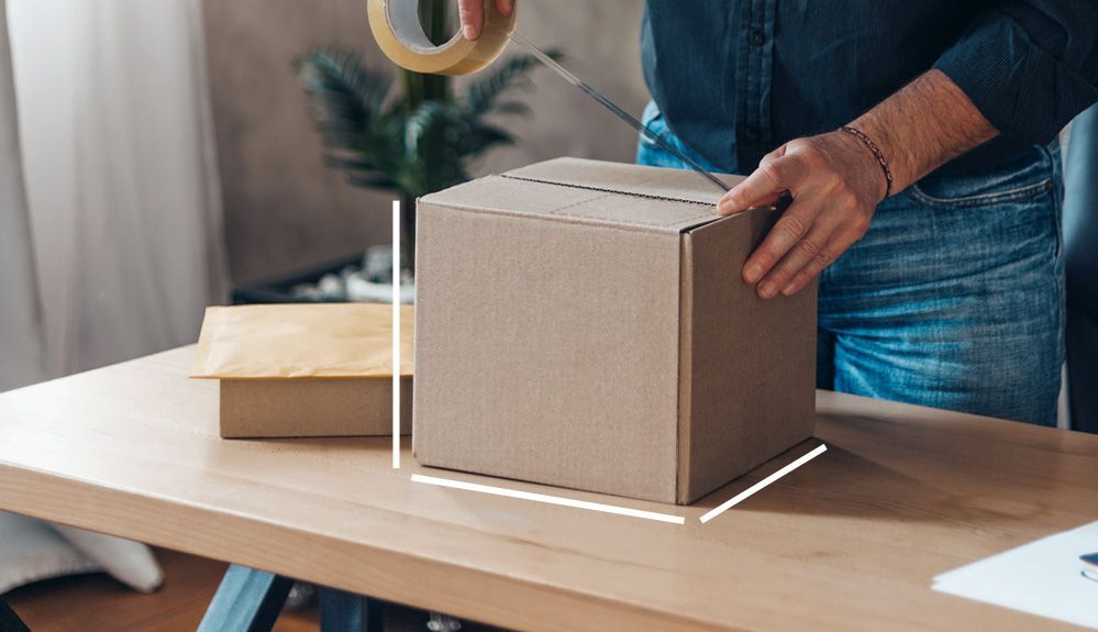
- Shipping
- New Tracking Pop-Up (April 2022)
Options
- Subscribe to RSS Feed
- Mark Topic as New
- Mark Topic as Read
- Float this Topic for Current User
- Bookmark
- Subscribe
- Mute
- Printer Friendly Page
Options
- Mark as New
- Bookmark
- Subscribe
- Mute
- Subscribe to RSS Feed
- Permalink
- Report Inappropriate Content
04-28-2022 01:32 PM - edited 04-28-2022 01:33 PM
I'm really hating this new tracking pop-up.
- More than half the pop up shows a pic of the item and estimated delivery date
- All the tracking info is hidden
- There used to be a line of text across the top that indicated a package was en route, but the text on that line would change during times of delays (holidays, weather, etc) - where will eBay put that text now or will they no longer put delay warnings up for buyers to see?
At the very least velvet@ebay, can you please stress to the team responsible that tracking details should not be hidden and require a link to see the tracking progress? It's a major time-waster. I could live with this change if tracking details weren't hidden.
As a buyer, I cannot stand companies that use a setup like this where the estimated delivery is giant, they show one single tracking status scan (the last one) and all the other tracking info is hidden, requiring an extra click to see the status.
As a seller, I click on that box to see tracking scans and that's now hidden, requiring an extra click to expand it.
Those extra clicks add up and I hate inefficiencies in business on things that should be straightforward and fast.
It might help if I remembered to include the screenshot I took.
Solved! Go to Best Answer
Message 1 of 7
1 BEST ANSWER
Accepted Solutions
New Tracking Pop-Up (April 2022)
Options
- Mark as New
- Bookmark
- Subscribe
- Mute
- Subscribe to RSS Feed
- Permalink
- Report Inappropriate Content
05-04-2022 04:54 AM
Anyone notice that all the recent changes eBay has made or are in the process of making, all require extra clicks to accomplish things? These programmers are "Click" happy. Instead of making things simpler and user friendly, they make them more complicated. How does a seller get through to a manager to tell them we are not happy with all the recent changes and that it is making more work for us?
Message 5 of 7
6 REPLIES 6
New Tracking Pop-Up (April 2022)
Options
- Mark as New
- Bookmark
- Subscribe
- Mute
- Subscribe to RSS Feed
- Permalink
- Report Inappropriate Content
04-28-2022 01:47 PM
The tracking page looks pretty clean. It will switch to "in Transit" once it leaves your USPS center. I don't mind clicking the tracking number or copying the tracking number & going to the USPS website for more information. Unless something is delayed, seeing all the scan points isn't necessary from this buyer's perspective.
Hang in there!
Message 2 of 7
New Tracking Pop-Up (April 2022)
Options
- Mark as New
- Bookmark
- Subscribe
- Mute
- Subscribe to RSS Feed
- Permalink
- Report Inappropriate Content
04-28-2022 02:16 PM
New Tracking Pop-Up (April 2022)
Options
- Mark as New
- Bookmark
- Subscribe
- Mute
- Subscribe to RSS Feed
- Permalink
- Report Inappropriate Content
04-29-2022 01:51 PM
The new tracking pop-up sucks. The old one showed the package's movement through the various cities where it was scanned. On the new one, you have to click on the link for "Tracking details" at the bottom to get that information. I ship a lot of packages and that extra action required on my part is a pain in the neck. Another example of eBay trying to "improve" something that was working fine.
Message 4 of 7
New Tracking Pop-Up (April 2022)
Options
- Mark as New
- Bookmark
- Subscribe
- Mute
- Subscribe to RSS Feed
- Permalink
- Report Inappropriate Content
05-04-2022 04:54 AM
Anyone notice that all the recent changes eBay has made or are in the process of making, all require extra clicks to accomplish things? These programmers are "Click" happy. Instead of making things simpler and user friendly, they make them more complicated. How does a seller get through to a manager to tell them we are not happy with all the recent changes and that it is making more work for us?
Message 5 of 7
New Tracking Pop-Up (April 2022)
Options
- Mark as New
- Bookmark
- Subscribe
- Mute
- Subscribe to RSS Feed
- Permalink
- Report Inappropriate Content
05-04-2022 05:27 AM
Yeah, I really don't like this new tracking popup.
It takes more clicks to do what only took one clock before
Message 6 of 7
New Tracking Pop-Up (April 2022)
Options
- Mark as New
- Bookmark
- Subscribe
- Mute
- Subscribe to RSS Feed
- Permalink
- Report Inappropriate Content
05-04-2022 10:24 PM
Even as a buyer I think its dumb.
Sometimes a clean look with less info is NOT the answer. Soon it will only show two things: Shipped and Delivered.
Sorry, but no. I like knowing at a glance where the package approximately is during its route. I also noticed as a seller that there are so many things you cannot get to from the "app" that you actually need to be signed in on the website either on a computer desktop or using the website in desktop mode on a mobile device in order to get to those items. There is NO consistency between the desktop site version and the app for sellers, at least that I can see.
Stop dumbing things down or simplifying them because they look smarter. Looking smarter and actually being smarter are two completely different things!
And as someone else said, stop making things click happy! We don't need more levels to things that then end up hiding tools we use!
 Gator08041971 • Volunteer Community Mentor 2024
Member of eBay since 2000
Message 7 of 7
About this board
Welcome to the Shipping board! Here you can discuss all things shipping with other members.
For news and more see:Shipping related questions? Start here:
Featured Posts