Updated "offers" page on android phone app is an improvement-thanks ebay team for a good change
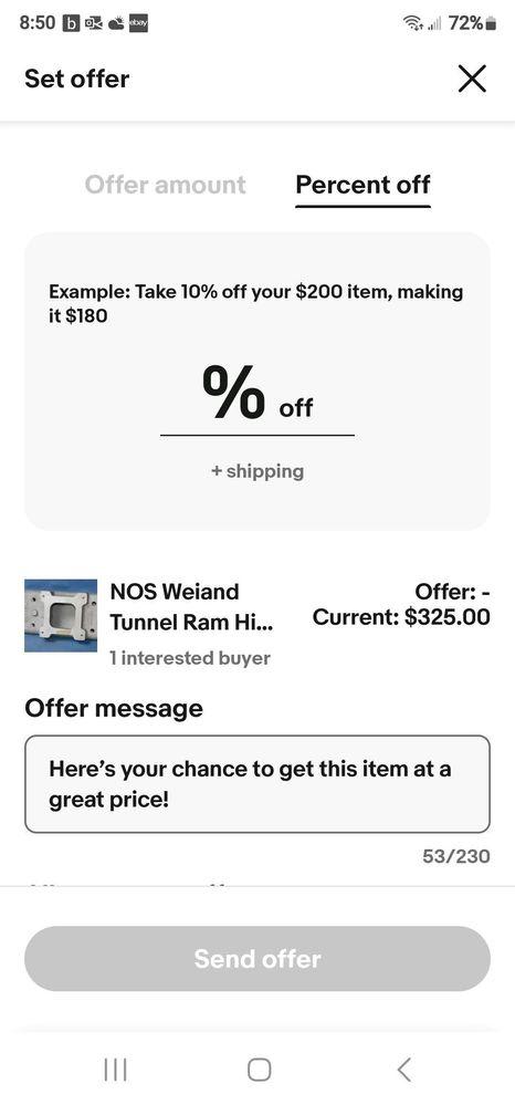
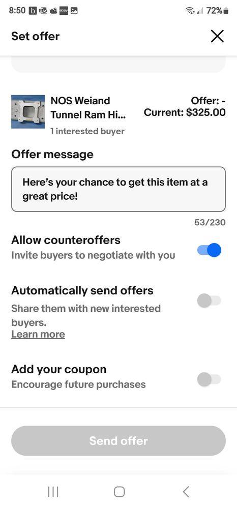
Yesterday - midday- the design on the offers section changed for android users. It is an improvement in design and function. It now includes all the needed options on one easy to see and understand page without having to pop in and out of submenus or popup boxes.
As a bonus it even seems to be functioning correctly and the "sticky key" options remember your preferred settings such as " allow counter-offers / yes or on" which had not worked in the previous version ever.
Anyway- i wanted to give credit where credit is due because this was a good progressive, non radical, and logical design change that is a benefit to sellers and while i am often critical of the nonsensical bad design changes we have often been forced into the last few years, I also believe in praising the good changes and saying "job well done". Thanks again for a good design!!

brightlightbookseller
That is a nice change. Now, I wish they would add more of the filters we have on the website to the app, instead of removing some of the filters on the website like the new version of the Active Listings page is using (we don't have the new version currently, thankfully, but I'm sure it's coming back at some point unless enough people complain that they scrap it). In particular, we don't send offers on anything we haven't added Best Offer too, so I use that filter when sending offers, but I can't on the app.
hartungcards
As long as "Go to Checkout" instead of "Accept Offer" is what buyers see when you send an offer, the whole Send Offer system, whether on the app or on desktop, is garbage and a waste of time for anyone sending multiple offers to the same buyer.
FYI @elizabeth@ebay
siamjane8
OP@wastingtime101 I generally agree with you that usually the app reflecting the website is better. Although the app should function as an app when it best makes sense.... ex. i hate how they got rid of the swipe left to dismiss notifications in the inbox on the app......now you must select a checkbox and hit delete and done!! it takes 3x longer to get rid of unwanted or already looked at inbox items. its frustratingly annoying to not have the most basic functionality of a phone app. my inbox on the phone just piles up with old notifications now and is cluttered because its just a friction point to get rid of the old notifications- then when i go to google notifications and swipe them away with my thumb.... i am constantly reminded of how it should be and wondering why on earth ebay would have gotten rid if the feature 😑
fbusoni
I guess it goes to show that if sellers complain often enough and strongly enough, eBay may pay attention.
Next: redesign the listing page on the mobile app so that buyers are not required to click a link to see a full description.
And move "More like this" and "Similar customers also bought" to the bottom of the listing, below shipping information, about this seller, and seller feedback.
In other words, give buyers a chance to assess the seller and make an informed buying decision before shoving other items into their faces.
tsme35
I'd be happy if they would finally add combined shipping to the app. I lost a $200 last week, buyer wanted 10 fishing rods, only had the app. So he would have had to buy one at a time, shipping $180 and I would have refunded the $150 extra back but buyer didn't want to front the shipping.
hartungcards
"I'd be happy if they would finally add combined shipping to the app"
Combined shipping isn't possible on offers sent on desktop either.
FYI @elizabeth@ebay
tsme35
Wouldn't know, don't take offers
hartungcards
This isn't about "taking offers," it's about offers that are sent to a buyer.
wastingtime101
I concur @siamjane8 . These changes are also available on the latest iOS app, v 6.174.0
On the older app version if you click the "send offer" banner just above the listing (single offer) you are limited to setting a $ amount with none of those toggle options.
But if you instead check the box next to the listing then click the blue send offers button that appears (bulk offer), it opens up all the settings in your screenshot except for the offer amount - it's limited to a % off.
With the new changes on v 6.174.0 the single offer settings mirror your screenshot. The bulk offer settings are the same except without the $ amount option. So really it's the single offer settings that were updated with proper functionality. This was a common point of confusion for app users and hopefully this change will eliminate those problems.
Basically, app function is now mirroring website function. (So much better than website function mirroring the app, right?)
FYI @elizabeth@ebay - this is a great change from the mobile team.
elizabeth@ebay
Thank you for the feedback @wastingtime101. I will pass this along to the mobile team.